
All Rights Reserved
Daeda Technologies
AI Ops
Reporting & Visibility
Stop Building Dashboards. Start Prompting Them.
Anthropic rolled out interactive visuals in Claude Chat. Instead of static text or images, Claude can now generate real-time, functional HTML mini-apps — charts you can click, filters you can toggle, dashboards you can interact with.
I wanted to see how far I could push this with Daeda MCP.
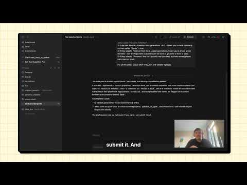
The Experiment
My prompt was simple: connect to my HubSpot via Daeda MCP and show me an interactive pipeline breakdown by deal stage with win probability.
In less than a minute, I had a live, interactive dashboard. I could toggle between total value, weighted value, and deal count. The data came straight from my HubSpot portal, through Daeda MCP, rendered as a visual I could actually use.
No report builder. No dashboard configuration. No dragging widgets around a grid. Just a sentence.
Why This Is Different
RevOps teams can spend hours configuring views in HubSpot’s reporting tools. Getting the right filters, the right groupings, the right visualisation type — it is a process. And when leadership asks “can you slice this a different way?”, you go back to the builder and start again.
With this approach, the dashboard is a conversation. Want to see it by region? Ask. Want to filter out deals under a certain value? Ask. Want to add a second chart comparing this quarter to last? Ask.
The AI does the data fetching, the calculation, and the visual rendering. You just describe what you want to see.
How It Works
Daeda MCP acts as the bridge between Claude and your HubSpot data. It syncs your portal’s contacts, companies, deals, and their associations to a local database that Claude can query directly.
When you ask for a dashboard, Claude:
- Queries your local HubSpot data through Daeda MCP
- Runs whatever analysis the question requires
- Generates an interactive HTML visual that you can use immediately
Because the data is local, queries are fast and there is no rate-limit concern. And because Claude generates real HTML and SVG, the visuals are genuinely interactive — not screenshots or static charts.
What You Could Prompt
A few ideas to get started:
- “Show me a pipeline breakdown by deal stage with win probability”
- “Which lead sources have the highest conversion rate this quarter?”
- “Compare deal velocity across my sales reps as a bar chart”
- “Show me a heatmap of when deals are most likely to close by month and stage”
Each of these would take meaningful time to set up in a traditional report builder. As a prompt, they take seconds.
Getting Started
The free version of Daeda MCP gives you read-only access to your HubSpot data through Claude. That is enough to generate interactive visuals like the ones described here.
Install the free version: npmjs.com/package/daeda-mcp
The full version — with write access, Plan Mode, and system design capabilities — is available now. Try Daeda AI.

